Your website may look polished in a presentation and still be difficult to use on a Tuesday afternoon. A buyer is trying to check your capabilities, find an answer, or request a quote between other tasks. If the design makes that job harder, another supplier is only a tab away.
Unclear messaging, confusing navigation, poor mobile layouts, slow or unstable pages, weak service detail, missing proof, difficult forms, intrusive overlays, inaccessible controls, and broken journeys can all create friction. Review the complete customer task before deciding which design change matters most.
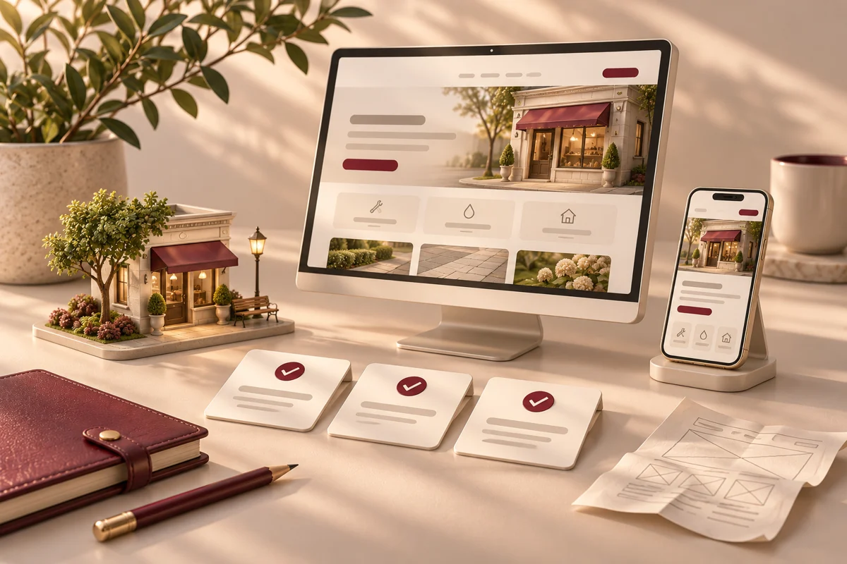
Features, workflow and outcomes
Features that address the daily bottleneck
Task-based navigation
Help buyers reach relevant details without guessing.
Responsive layouts and accessible controls
Make reading, calling, and forms usable across devices.
Form validation and delivery checks
Keep the customer informed and route the inquiry.
URL inventory and launch verification
Preserve relevant journeys through the redesign.
How the workflow fits together
A relatable example
An illustrative industrial service buyer opens a site on a phone, struggles to compare services, and loses a detailed form entry after a validation error.
- Choose a customer task and test it without coaching.
- Document the specific friction and affected page or device.
- Fix blocked tasks before visual refinements.
- Retest inquiry delivery and preserve useful URLs at launch.
How to judge whether it helps
These are intended operating improvements to validate in a pilot. They are not promised financial or performance results.
| Feature | Useful outcome | Measure against your baseline |
|---|---|---|
| Task-based navigation | Help buyers reach relevant details without guessing. | Task completion and navigation feedback |
| Responsive layouts and accessible controls | Make reading, calling, and forms usable across devices. | Device-specific failures and manual task checks |
| Form validation and delivery checks | Keep the customer informed and route the inquiry. | Submission errors and confirmed delivery |
| URL inventory and launch verification | Preserve relevant journeys through the redesign. | Broken links, redirects, and working contact paths |
Review the task, not just the appearance
Pick one realistic task: request a commercial property inspection, upload drawings for a machining quote, or ask about a software project. Start from the page a customer would actually land on. Try the task on a phone and a desktop, and note every point where you hesitate.
Ask someone unfamiliar with your business to explain what the page offers and what they would click next. Watch without coaching them. Their questions often reveal problems that your team no longer notices. Combine this feedback with inquiry quality, form failures, and page-level analytics.
10 design mistakes to check on your business website
1. A beautiful first screen with no clear offer
An oversized image and a slogan can leave buyers guessing. Use the main heading to explain the service and audience. Add a concise supporting sentence and an action that matches the decision. A visitor should not need to scroll through a company history to learn what you sell.
For a manufacturer, put the process or capability in plain language. For an adjusting firm, distinguish public adjusting from independent carrier work. Specific wording helps prevent the wrong inquiry as much as it helps attract the right one.
2. Navigation built around your org chart
Customers do not know your internal department names. Group services using familiar terms and keep important options easy to reach. If a buyer needs to compare capabilities, make that comparison possible without opening a maze of nested menus.
Use descriptive link labels. ‘View commercial inspection services’ gives more context than several identical ‘Learn more’ links. Include a reliable route back to the service list and make the current location understandable.
3. A desktop layout squeezed onto a phone
Small type, cramped controls, wide tables, and overlapping sticky elements turn a simple task into work. Review actual devices, including landscape orientation where useful. Check that a phone keyboard does not hide the current field or the error message.
Make contact actions usable and let tables scroll without breaking the whole page. Show relevant content in a sensible order. Mobile visitors may be serious buyers checking a supplier from a jobsite, not casual traffic to deprioritize.
4. Heavy visuals that delay the useful content
A large background video can be attractive while keeping the offer out of reach. Compress and size images appropriately, load below-the-fold media when needed, and avoid unnecessary scripts. Reserve image dimensions so content does not shift after a visitor starts reading.
Review Core Web Vitals and real use together. Loading speed, responsiveness, and visual stability describe different parts of the experience. Fix the issue buyers encounter instead of chasing a perfect score on a page they never visit.
5. Service pages that say too little
A heading, a stock photo, and two generic sentences rarely help a buyer evaluate fit. Explain what is included, what is outside scope, what information you need, and what happens next. Answer the questions your team repeats on introductory calls.
A manufacturing RFQ page can explain accepted drawing formats and the details needed for a quote. A software page can show a sample workflow and describe integration dependencies. This is useful sales information, not extra text added to reach a word count.
6. Proof that is vague or hard to verify
‘Trusted by leading businesses’ is less useful than an authentic example with context. Show relevant work and explain your role. Use client names, testimonials, and logos only when permitted. Make it clear when an interface is a concept rather than a delivered client product.
Identify your business and provide working contact information. If you serve US customers remotely, explain collaboration and availability accurately. Buyers need an honest view of who they will work with.
7. Forms that feel like a procurement exercise
Do not ask a first-time visitor for every project detail before they can start a conversation. Separate essential information from later discovery. Use clear labels, explain required fields, and preserve entries when validation fails.
After submission, show a useful confirmation and set a response expectation your team can meet. Test delivery to the inbox or CRM. For sensitive documents, provide an appropriate secure route rather than encouraging customers to attach private records to a general inquiry.
8. Pop-ups competing with the customer’s task
A chat invitation, cookie panel, newsletter offer, and sticky promotion can cover most of a phone screen. Review them together. Give visitors control, keep dismissal straightforward, and avoid interrupting a form halfway through.
Keep the primary task visible. If a tool is not helping visitors contact you or understand the service, reconsider its placement. Measure real use before assuming another widget makes the website more helpful.
9. Controls some visitors cannot use
Low-contrast text, unlabeled fields, image-only instructions, and menus that require a mouse can block access. Use semantic headings, readable contrast, meaningful labels, and visible keyboard focus. Do not communicate an error through color alone.
Try the main journey using a keyboard and confirm that menus, dialogs, and forms can be operated. Automated checks can identify some problems, but they do not replace manual review. Accessibility work helps more people complete the same business task.
10. A redesign that breaks existing journeys
New layouts can accidentally remove useful content, change working URLs, or disconnect forms. Inventory important pages before rebuilding. Map changed URLs to relevant replacements, preserve useful internal links, and test old entry points after launch.
Check analytics, contact numbers, confirmation messages, and CRM connections on the production site. A polished homepage does not compensate for a broken quote page. Use a launch checklist tied to actual customer tasks.
Turn the review into a practical fix list
Prioritize problems by customer impact and effort. Broken contact routes and unusable controls come first. Next, address unclear offers and missing decision information on high-intent pages. Cosmetic consistency can follow once the essential journey works.
Write each task as an observable problem: ‘Mobile visitors cannot close the menu’ is actionable; ‘the site feels dated’ is not. Add an acceptance check, such as completing a quote request on a phone and confirming its arrival in the CRM. This gives your designer, developer, and sales team the same definition of done.
Turn the review into a practical first phase
Bring your website URL, primary customer task, current pain points, and examples of inquiries you want more of.
Request a website design review ↗What a useful redesign brief should include
Bring your most important services, typical customers, common questions, existing analytics, and examples of good and poor inquiries. Identify pages that already bring relevant visitors. Agree on the content, page templates, mobile behavior, form workflow, and launch checks before debating visual effects.
Deepak Softech can scope a focused improvement or a wider website redesign around these needs. Where inquiries need routing or tracking, the project can include CRM integration. The goal is a site that helps buyers make a decision and gives your team a reliable next action.
Frequently asked questions
How do I know whether my website needs a redesign?
Review real customer tasks first. A redesign may help when structural, mobile, or platform problems affect many pages. Isolated issues may be better handled through focused repairs.
Can website design affect SEO?
Design decisions can affect readable content, internal links, mobile usability, loading behavior, and URL structure. Preserve useful content and plan redirects when changing existing URLs.
Should every business website have a chatbot?
No. Choose tools around customer needs and your ability to respond. A clear service page and a reliable contact route may be more useful than an unattended chat widget.
How can I test whether my contact form works?
Submit realistic tests on mobile and desktop, including invalid entries and any permitted attachments. Confirm the success message, inbox or CRM receipt, source tracking, and assignment to a responsible person.
Will fixing design mistakes guarantee more customers?
No. Better usability removes friction, but results also depend on demand, traffic quality, offer fit, pricing, trust, and follow-up. Track qualified inquiries and sales outcomes alongside website behavior.
What should I prepare for a project discussion?
Bring your website URL, primary customer task, current pain points, and examples of inquiries you want more of. The goal is to identify the first useful scope and its dependencies.
Sources and editorial notes
Reviewed November 5, 2026 by the Deepak Softech editorial team. Examples are illustrative. Recommendations should be adapted to your business and verified against current documentation. Search visibility, AI citations, and lead outcomes are not guaranteed. Cover artwork is an original AI-generated concept.
Bring your website URL, primary customer task, current pain points, and examples of inquiries you want more of.
What we can scope: A customer-task review and practical redesign scope
Request a website design review ↗Explore the relevant development service · Browse the complete guide collection
 Chat with us